Lecture Series

First Things First -Adriana Eysler Lecture

FIRST THINGS FIRST MANIFESTO (1964)KEN GARLAND 

The beginning of the lecture started off discussing the arts and crafts movements, which started in Britain in the 1880s. We briefly discussed Augustus Pugin and John Ruskin but mostly looked at William Morris. It was interesting to find out that Morris implied that ‘design style and production methods expressed the quality and values of culture’ and that he believed in restoring dignity of labour and the pleasure of craft and the interest in ‘returning to a simpler life’. Relating this today it’s noticeable that we’re dipping back into the production of limited goods with the help of websites like Etsy and eBay, which allow people to sell their handmade goods to a wider range of people than those that attend crafts fairs.

“The pivotal position of design within contemporary culture traces back to the turn of this century [20th], and its growth in importance is inextricably linked to the rise of industrial mass production.” –Stuart Ewen

Screen Shot 2015-03-12 at 13.57.03

The labour intensive process of the lettering would not have you thinking about a mass-produced and urban lifestyle. This moved swiftly onto the idea of industrial modernisation, looking at the Bauhaus movement in Germany. The phrase ‘artistic avant-garde’ came up (much like in Author as Producer) and how they wanted to become capable of changing society, hoping to embrace functionalism, geometric formalism and machine aesthetics. The role of the graphic designer was being challenged as one to shape and manipulate public opinion and the social responsibilities one faces.

It was first in WWI that designers worked with psychologists to create most effective propaganda posters encouraging and recruiting men into battle, promoting and suggesting their readiness. This then continued with fascist propaganda in Germany which was at the same time as the Bauhaus movement, it was Bauhaus that asked the question: “How can we improve society through design?” and the Nazis that wanted to mould society into yes men that thought how they were told. Unfortunately the Nazis had won, claiming Bauhaus ‘degenerate’ leaving it to live only until 1933 but it’s revolutionary typography and layouts still inspire designers today to think beyond form. “Art for us is an occasion for social criticism, and for real understanding of the age we live in.”

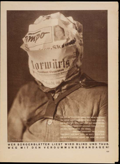
JOHN HEARTFIELD, 1930

JOHN HEARTFIELD, 1930

‘Whoever reads bourgeois newspapers becomes blind and deaf: away with these stultifying bandages.’

This suggesting that we are blinded from social reality and are brainwashed into believing the opinions of the big corporations that lead our consumerist behaviours.

“Design has become a corporate profession”

We then moved onto Culture Jamming which suggested that corporation is now making our culture through consumerism and that we need to stop consuming so that we can take back control of our culture. ‘Advertising has clogged all communication channels’. Brands like Nike and Adidas are relying on their ‘cool’ image and the ‘flawless’ messages they send to convince consumers they are the brand for them (and it’s working)!

Would I sign the First Things First Manifesto?

Before this lecture I loved branding and the way advertising can manipulate the consumer because I thought it was intelligent and innovative but now I’m not so sure that it really is good for the future of design. It because apparent in the seminar with Andrew that when we read through the text that thanks to consumerism good design has become decided through how much it sells rather than the message it communicates. So with more thought and consideration I am much more inclined to sign the manifesto than I may have been before the lecture.

Standard
Lecture Series

“After a Fashion” -Dene October Lecture

“Nothing beats leafing though the pages of the latest thriller -especially when it’s a posh clothing catalogue” –Lauren Laverne

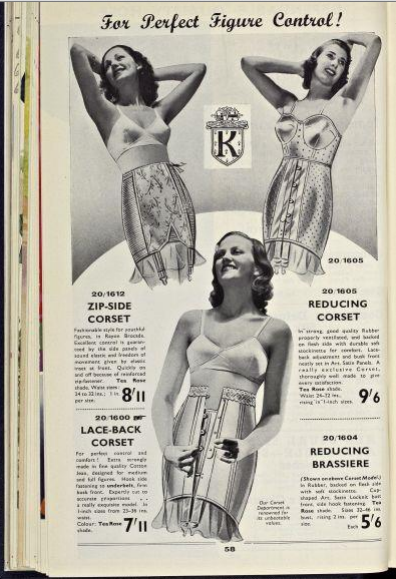
The first thing we learn in this lecture is that catalogues were a tool used to ‘encourage loyalty and patterns of consumption’ by department stores (mostly for women.) It’s not uncommon knowledge that women have always been the main priority when advertising fashion and clothing -since the industrial revolution. But in the now metrosexual (western) world we live in it is of that the majority of men take much more care and pride in the fashions and trends they involve themselves in.

‘Graphic design and new psychology helped promote fashion’

Screen Shot 2015-03-11 at 12.13.08

‘Kay’s S/S 1940: How is the page encoded to provide meaning to the reader? sans serif justified (rational) type for specific details with salience of type (bold and weighting); use of breathing space to box brand message; use of script to reinforce the casual gender imperative: Like Father Like Son! (note the exclamation!)’

This links in with advertising and what it means to place objects on a page to make the most of the message you want to communicate. This isn’t dissimilar to John-Patrick’s lecture and the idea that each detail of a peace of design, whether it just be type or image and type,or shape, line, image and type,  it’s imperative that they all fit together and create a piece of  design that is the most efficient in doing its job of communication.

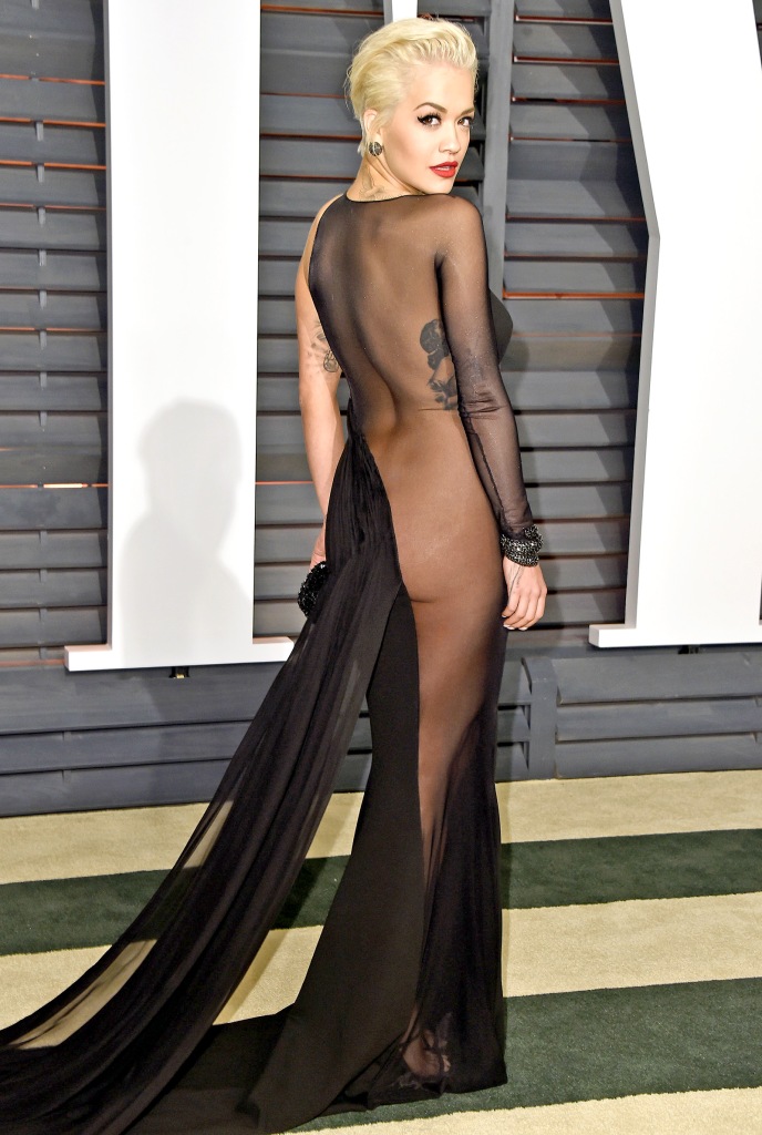
In the lecture the link between fashion and communication really came across. It was expressed that we are increasingly more sexually displayed, making our bodies shown through our clothes. This reminds me of Kendall Jenner at New York fashion week when she modelled for Marc Jacobs, she wasn’t the only model but she was made to dress in a transparent top without underwear which made for a very revealing outfit.

Rita Ora at the 2105 Oscars After Party

Rita Ora at an 2105 Oscars After Party

These days this is so normal to us, seeing celebrities dressed with very little left for the imagination, when in the 20s, 30s, 40s and 50s it was often that the only way you got to see a lady in underwear was when it was being advertised in a catalogue.

Screen Shot 2015-03-11 at 12.12.41

The liberation of the female form is something we have encouraged through ‘free the nipple‘ campaigns and other campaigns that have been championing women’s equal rights towards men. I think the equality between men and women has become key, especially when looking at fashion and expression through clothing.

“We are governed, our minds are moulded, our tastes formed, our ideas suggested, largely by men we have never heard of… who understands the mental processes and which control the public mind” –Edward Bernays, Propoganda (1928)

Another topic brought up was that of masculinity and how it is losing meaning and prevalence. “Masculinity is not a given, it… is created and manipulated through film, magazines, advertising and, of course clothing.” –Christopher Breward

It has become clear that though this lecture has been about the importance of communication and advertising to the right audience, it has also been about the evolution of the audience. From middle-class women with wealth to everyone, however now as Lauren Laverne refers to that of a ‘posh’ clothing catalogue it is now that there are different catalogues for different wealths and classes. The categories of cataloguing has expanded also not only into fashion but into household items with companies such as Argos and Ikea to name a couple.

Standard
Lecture Series

Typography & Communication: John-Patrick Hartnett Lecture

“Typography at its best is a visual form of language linking timelessness and time.” –Robert Bringhurst, The Grand Design.

This suggests a much deeper meaning and duty for typography, more so than the definitions given by Collins English Dictionary (“The art, craft or process of composing type and printing from it”) and Encyclopedia Britannica (“Typography is concerned with the determination of the appearance of the printed page”). Both definitions seem fairly vague and under sell the responsibility typography has within all text. Referring to it as a form of language infers that it isn’t just the words that are communicating, but the aesthetics of those words are communicating as well.

In the lecture Gerrit Noordzij is mentioned and his notion that “typography is writing with prefabricated letters”. It is also discussed that this definition ‘deliberately avoids connecting typography to any specific medium, as these tend to change, while the discipline continues to evolve.’ This evolutionary concept links perfectly with Bringhurst’s idea of linking time with timelessness, that even though the basic lines and shapes are there, they’re altered to mould to the changes in trend, events and the general content of the text.

“Well-chosen words deserve well-chosen letters; these in their turn deserve to be set with affection, intelligence, knowledge and skill.”

This quote (also from Robert Bringhurst’s The Grand Design) reminds me of the tv programme Sunday Brunch; the co-host and resident chef Simon Rimmer always says that you can make any dish taste great with the best ingredients. With this analogy of course the text would be the dish and the ingredients the typography.

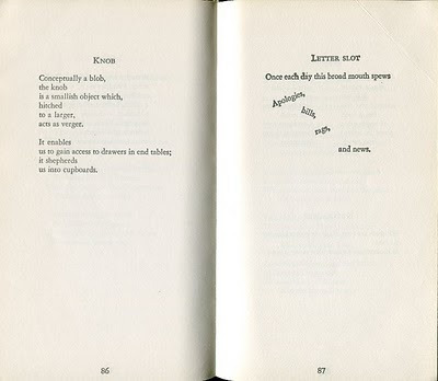
I looked at a few examples given in the text and one that stood out to me was that of Far Tortuga by Peter Matthiessen. It wasn’t necessarily the typeface used as much as the placing of the words, however the simple typeface ends to the complex shapes the words form into.

Far Tortuga Far-Tortuga-P-Matthiesson

“Typography is the craft of endowing human language with a durable visual form, and this with an independent existence.” -Robert Bringhurst, The Elements of Typographic Style 1992

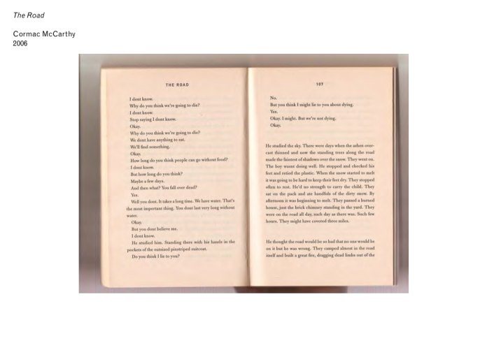
It hadn’t occurred to me before that typography wasn’t just the adaptation of the shapes of the letters and how they assemble into words, but the assembly of those words onto the page. Some of the examples we were given really showed that type is about the relationship between every character, letter, word, sentence etc.

The Road -Cormac McCarthy (2006)

Blast journal spreads -Wyndham Lewis 1914 Cavellini Collection -Armin Hofmann poster 1958 Cover for Typographische Monatsblatter No. 5 -Wolfgang Weingart 1973 Fontana poster -AG Fronzoni 1966 These images were cut directly from the lecture John-Patrick gave, this idea that typography exists to honour the content brings me back to the food analogy.

If you were to go to a michelin star restaurant and order a dish you’d expect the food on the plate to look incredible; you’d expect strategically placed vegetables with perfectly sliced meat and the sauce drizzled on in a delicate pattern. You expect this because you know that if you’re ordering food from a michelin star restaurant then you know you’re paying a lot of money for the best food, the best ingredients to make it, the best chefs preparing it and the best recipe. The ingredients and the way the food is served honours the dish and of that michelin star.

Unfortunately as I wasn’t in the lecture I wasn’t able to get the full picture but typography interests me a lot, and now that I can see a new dimension to it I’m very interested in doing my essay on the subject.

Standard